
Cover Image Flockhart K, Untitled Study (2023)
Compare the work of 2 artists who use of charcoal is quite different. Describe the range and quality of marks used, the use of line and tone, the scale of the work and the quality of its surface, the composition and how the drawing occupies the paper. Record your thoughts and observations, think about your own drawing activity; what will you take from this research?
ANITA TAYLOR & CHRISTINE KIM SUN
2 Artists with a personal message, deliberately using charcoal to communicate.
Seemingly polar opposites. But maybe not. The more I get into my note taking, the more connections I see.
AT works large, expressive, a full range of mark making. From the quick blocking in of form, to drawn lines like rivers and estuaries mapping out the landscape of her face. Rubbing it away, building it back up. Forging, forging, forging. Like excavating her own face from the mirror and building it back up on paper.
The scale is important. An antidote to the virtual world. The formulated, the edited, the expressionless.
My first thought on seeing her portraits was…she is rural. Her use of charcoal reminds me of the elements. Wind whipped tonal scribbles, sunlight hitting the rises of form, dense pressure sculpting out pathways. Over and over again. A season, a change, another layer. Until it rests at place that has seen
The lightness of spring
The bake of summer
The autumn shed
And the enduring winter
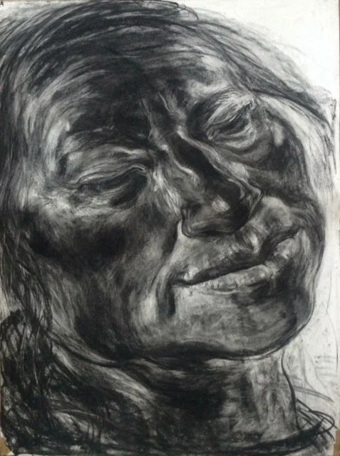
Fig.1 Taylor A, Breeze (2019)
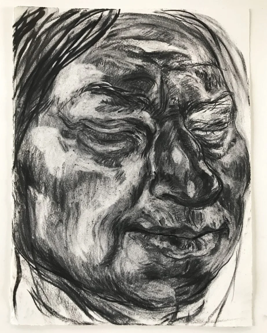
Fig.2 Taylor A, Pause (2019)
And then, CKSun. So prescriptive and precise. But also so ironic, to use such an unpredictable, messy medium. Is that the point? Is that how she feels? Humans are messy and expressive, but without her hearing and speech she is so prone to being smudged, erased, abstracted.
So she takes this stick of expression and controls it. To tell her story.
It’s softness in written line (lessen the harshness of pen) shows humanity. The smudges and fluctuations necessary.
When blown up to large installations the delicate nature is not swallowed up by the scale. The work still occupies the space with the same authority. And although created with less drama the qualities of the charcoal are still as effective.

Fig.3 Kim Sun C, Why My Hearing Daughter Signs (2018)

Fig.4 Kim Sun C, Degrees Of my Deaf Rage In The Art World (2018)
I like how charcoals softness can alter written marks. And the finger prints and hand smudges illustrate the presence of a person. Pen work is often too close to print for me. And I regularly disrupt my pen nibs with scalpels to give their lines more personality. Now I will use more charcoal for the same effect.
The use of charcoal layers and mark making, imitating a landscape and all its elements interested me. What at first appeared dominating and intrusive, became narrative and accessible.
I will think about how I can experiment with text and symbolism x storytelling x living line force.
List of Images
Cover Image Flockhart, K (2023) Untitled Study [Charcoal on paper]
Fig.1 Taylor, A. (2019) Breeze. [Charcoal on paper] At: http://padstowstudio.co.uk/2016/07/anita-taylor-breeze/ (Accessed 27/11/2023).
Fig.2 Taylor, A. (2019) Pause. [Charcoal on paper] At: https://drawingprojects.uk/index.php/exhibitions/past-exhibitions/204-in-focus-drawings-by-anita-taylor (Accessed 27/11/2023).
Fig.3 Sun Kim, C. (2018) Why My Hearing Daughter Signs. [Charcoal and oil pastel on paper] At: https://www.frieze.com/article/christine-sun-kim-profile-2022 (Accessed 27/11/2023)
Fig.4 Sun Kim, C. (2018) Degrees Of my Deaf Rage In The Art World. [Charcoal and oil pastel on paper] At: https://www.frieze.com/article/christine-sun-kim-profile-2022 (Accessed 27/11/2023).
Bibliography
Emily McDermott (2022). Christine Sun Kim on Breaking the Echo Chamber. Available at: https://www.frieze.com/article/christine-sun-kim-profile-2022 (Accessed 27/11/2023).
Drawn Anita Taylor – In the Artists Studio (2020) [Video]. At: https://www.youtube.com/watch?v=2yA51EgaTVg (Accessed 27/11/2023).